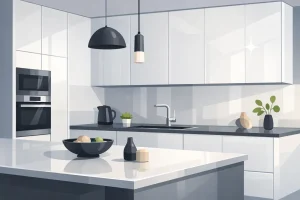

You’ve approved the cabinets, the countertop is installed, and the island finally reads as the centre of the kitchen. Then the pendants go up, and the balance is wrong. The fixtures cut across sightlines, disappear against tall cabinetry, or bounce sharp reflections off high-gloss doors and polished stone.
I see that often in Toronto and Markham renovations. Pendant lights over island areas are not just decorative pieces. They affect task lighting, visual weight, and the way cabinet finishes look after sunset. A matte shaker door can soften a bold fixture. A gloss slab door can magnify every hotspot, bulb reflection, and finish mismatch.
That cabinet-and-light relationship gets missed early in the process. Homeowners often choose pendants by shape or finish alone, then realize too late that black metal can look heavy against pale matte cabinetry, or that clear glass over a glossy kitchen creates more sparkle than comfort. The right fixture needs to suit the island’s size, the ceiling height, and the surface reflectivity around it.
Done well, pendant lighting makes the kitchen feel settled and intentional. Done poorly, it can make new cabinetry look colder, shinier, or less expensive than it is.
Why Perfect Island Lighting is a Kitchen Game Changer
A kitchen island usually carries too many jobs for one light source. It’s where breakfast gets served, homework gets spread out, groceries get dropped, and prep work happens at the end of a long day. Recessed lights alone rarely handle that mix well. They can flatten the room, leave shadows where you need clarity, and make a beautiful island feel like just another work surface.
Pendant lights fix that when they’re chosen with intent. They bring task light down to the surface, give the island a visual anchor, and help the room feel finished rather than merely renovated.

Why buyers and homeowners notice them first
In practice, pendants act like the jewellery of the kitchen, but that comparison only goes so far. Good jewellery can be removed. Good island lighting becomes part of how the room is used every day. It frames the island from every angle, especially in open-concept layouts where the kitchen is visible from the entry, dining area, or family room.
That’s one reason professionally lit kitchens stand out in listings across Toronto neighbourhoods and newer Markham subdivisions. The fixtures signal that someone paid attention to proportion, finish, and function. People may not name those details precisely, but they feel them.
A kitchen can have excellent cabinets and still look unfinished if the pendants are undersized, badly placed, or too harsh for the surfaces below.
The difference between attractive and usable
The biggest mistake isn’t choosing an ugly light. It’s choosing a light that photographs well online but performs poorly over a real island. A large smoked-glass fixture may look dramatic in a showroom. In an everyday kitchen, it can cast awkward shadows, compete with upper finishes, and collect more grime than people expect.
A better approach starts with use first, then style. Ask what happens at the island during a normal week. Is it mostly prep space, mostly seating, or both? Are the cabinet finishes reflective or soft? Does the room need warmth at dinner and clarity in the morning?
Those answers lead to pendants that work as part of the kitchen rather than hovering above it as a separate decorating decision.
The Three Golden Rules of Pendant Placement
Good placement does more than keep pendants centred. It determines whether the island feels comfortable to work at, whether sightlines stay open, and whether the light flatters the cabinet finish below or exaggerates every fingerprint and glare point.
The three rules are simple. Set the right hanging height, space the fixtures as a group, and choose a fixture count that suits the island instead of following a showroom formula.

Hang them at the right height
For most 8-foot kitchens in Toronto and the GTA, pendants belong about 30 to 36 inches above the countertop. That range usually keeps the light useful for prep while preserving clear views across the room.
Height also changes how cabinet finishes read. A pendant hung too low can create hard hot spots on high-gloss lacquer or polished quartz. Hung too high, the island loses task light and matte finishes can start to look flat by comparison. The goal is controlled light, not just enough light.
Measure from the countertop up, not from the ceiling down. The island is the working surface, and the reflective quality of that surface matters. In a kitchen with glossy slab doors, I often stay disciplined about height because even a small drop can increase visible glare. In a kitchen with warmer matte cabinetry, there is usually a bit more tolerance.
Space them like they belong together
Spacing decides whether multiple pendants feel intentional or restless. The group should relate to the island first, then to the room around it.
A practical layout usually follows these checks:
- Centre the grouping to the island, not the room: Open-concept kitchens are often slightly offset from dining or living zones. The pendants should still line up with the island.
- Keep consistent gaps between fixtures: Uneven spacing reads as a mistake, especially with simple modern pendants.
- Leave room at both ends of the island: Outer pendants pushed too far toward the edges make the whole composition feel cramped.
- Account for finish reflectivity below: On glossy cabinets and polished counters, tight spacing can create repeated reflections that make the ceiling line feel busy. Matte finishes hide that effect better.
If the island layout is still being refined, use a kitchen design layout with island guide before electrical rough-in. Pendant locations are much easier to set once the stool overhang, prep area, and walkways are fixed.
Practical rule: If two pendants throw light onto the same small patch of countertop, they are too close together, too large, or both.
Match the number of fixtures to the island
The usual question is one, two, or three pendants. The better question is how many the island can carry without crowding the room or fighting the cabinetry.
Two pendants often work well on mid-size islands found in Toronto renovations, but that is not a rule to force onto every project. A narrow island paired with solid metal shades can look cleaner with one linear fixture or two smaller forms. A longer island with lighter glass pendants may support three without feeling heavy.
Cabinet finish matters here more than many homeowners expect. Three shiny chrome pendants over high-gloss cabinets can create far more visual activity than three plaster or linen-look fixtures over matte oak. The fixture count may stay the same, but the room will not feel the same.
Here’s the quickest decision filter:
| Island condition | What usually works | What often fails |
|---|---|---|
| Narrow island with bold pendants | Fewer, visually heavier fixtures | Too many lights compressed together |
| Mid-size rectangular island | Two medium pendants | Tiny pendants that vanish in the room |
| Long island with lighter fixtures | A rhythm of smaller forms | Oversized shades that dominate every sightline |
Getting the Scale Right How to Size Your Pendants
Sizing pendant lights over island spaces is where many otherwise good kitchens lose balance. Homeowners often shop by diameter alone, but the eye doesn’t judge diameter in isolation. It judges visual weight. A clear glass globe and a solid black dome can share the same width and still feel completely different overhead.

Visual weight matters more than shoppers expect
An open-frame pendant lets the room show through it. That makes it feel lighter and often smaller than its actual dimensions. A closed metal shade does the opposite. It blocks more visual space, creates a stronger silhouette, and feels larger from across the room.
That’s why two fixtures with the same listed size can produce opposite results. One disappears. The other dominates.
When reviewing options, don’t ask only, “Will this fit?” Ask these instead:
- How opaque is the fixture body?
- Does the shade feel airy, dense, reflective, or heavy?
- Will the pendant read as a quiet accent or the first thing you see?
For homeowners working with compact layouts, these questions become even more important. A smaller room can still handle striking pendants, but they need to be chosen with the island and circulation space in mind. This collection of small kitchen island ideas is useful if you're trying to judge scale in a tighter footprint.
A practical way to judge proportion
The fastest on-site test is low-tech. Mark the rough footprint of each fixture with painter’s tape on the ceiling or hold cut-out circles at the planned locations. Then step back to the kitchen entry and the adjacent living area. Pendants aren’t viewed only from directly below. They’re seen from all over the main floor.
A few common sizing problems show up quickly:
- Too small: The island looks oversized and the pendants feel apologetic.
- Too large: The lights visually press down into the room.
- Too ornate: The fixture shape fights with veining, hardware, stools, and backsplash pattern.
- Too delicate for the room: The pendants vanish once cabinetry, venting, and appliances are in place.
This visual walkthrough helps before any purchase is locked in.
Shape changes scale too
Round shades usually read softer and take up less visual width than boxy or angular fixtures. Long cylindrical pendants can work over narrow islands, but if the kitchen already has many vertical lines from pantry doors and tall units, too many cylindrical forms can make the room feel rigid.
A good pendant should feel related to the island, not identical to it. If the island is thick, square-edged, and visually solid, lighter pendants often create better balance. If the island profile is slim and refined, slightly weightier pendants can give the room a centre of gravity.
Creating a Cohesive Look Matching Pendants to Cabinetry
The most overlooked part of pendant selection isn’t style. It’s surface behaviour. Light hits matte cabinetry differently than it hits high-gloss HDF, painted wood grain, laminate, or thermofoil. If the fixture ignores that, the kitchen can feel uncomfortable even when every item looked right in the showroom.
High-gloss finishes are the most demanding. As noted in this Houzz kitchen pendant guide, high-gloss cabinet finishes can reflect pendant light intensely and create glare, while matte finishes absorb light differently. Pendant brightness and style need to respond to that interaction.
High-gloss cabinetry needs controlled light
A glossy slab door can look sharp and architectural, but it acts almost like a mirror in certain conditions. If you pair it with open-bottom pendants that throw a hard, direct pool of light, you can end up seeing hot spots on doors, side panels, and even polished stone.
What usually works better over high-gloss kitchens:
- Softer diffusion: Shades or bulbs that reduce harsh point-source reflections
- More restrained finishes: Satin, brushed, or muted metals rather than highly mirrored chrome
- Careful brightness control: Enough task light for prep, but not so much that the room sparkles in the wrong places
What often disappoints:
- Clear glass with exposed bright bulbs: It can look crisp in photos and tiring in real life.
- Highly polished fixtures over already reflective cabinetry: Too many reflective surfaces compete.
Matte finishes can carry stronger fixture statements
Matte HDF and other low-sheen surfaces absorb light more gently. That gives you more freedom with pendant shape and finish because the cabinetry won’t bounce every beam back into the room. Black, bronze, smoked glass, or sculptural metal forms usually sit more comfortably here.
That doesn’t mean matte surfaces are forgiving of everything. Very dark matte cabinets can visually swallow weak lighting. If the pendants are too timid, the island can feel flat at night.
In matte kitchens, the issue usually isn’t glare. It’s making sure the cabinetry still has depth after sunset.
Wood grain and painted wood benefit from warmth
Real wood painted doors with visible grain respond beautifully to warm metals and softer light character. Brass, aged bronze, and some fabric-accented or frosted-glass pendants can pull out the richness of the material without making it feel yellow.
The key is to support texture, not mask it. If the fixture throws a stark, cool-looking light, grain details can appear lifeless. If the fixture is too decorative, it can distract from the cabinet craftsmanship itself.
A quick pairing guide by cabinet finish
| Cabinet finish | Pendant direction | Why it tends to work |
|---|---|---|
| High-gloss HDF | Diffused light, restrained shine | Helps reduce glare and reflection fatigue |
| Matte HDF | Stronger silhouettes, darker finishes | The surface absorbs light and carries contrast well |
| Painted wood with visible grain | Warm metals, softer shade edges | Supports texture and natural variation |
| Thermofoil or smooth contemporary finishes | Clean lines, simple geometry | Keeps the kitchen looking intentional rather than busy |
| Durable laminate in active family kitchens | Easy-clean forms, less intricate detailing | Practical upkeep matters as much as appearance |
The best kitchens don’t match pendants to cabinetry in a literal way. They balance them. If the cabinets are visually active, the light should be quieter. If the cabinetry is simple and flat-fronted, the pendants can take on more personality.
Lighting Solutions for Custom Kitchen Islands
Most pendant advice assumes a straightforward rectangular island. Real renovation projects often aren’t that simple. Many custom kitchens now include tiered surfaces, seating wings, prep-heavy sections, curved ends, or L-shaped forms. Standard guides offer very little help for those layouts, and that gap has been noted in this discussion of irregular island pendant arrangements.

L-shaped and broken-plan islands
An L-shaped island usually includes two visual zones, not one. Trying to force a single straight line of pendants across both legs often looks awkward because one side always feels underlit or irrelevant.
A better solution is to decide which leg needs the visual anchor. In many kitchens, that’s the longer seating or prep section. The secondary leg can rely on recessed lighting or a smaller companion fixture if it needs emphasis.
Cabinetry planning and lighting planning must be done together. If you're building around drawers, seating supports, appliances, and overhangs, reviewing cabinet options for a kitchen island before fixing pendant positions can prevent expensive changes later.
Tiered islands and mixed-use surfaces
Tiered islands need a hierarchy. The lower work surface usually benefits from the more functional light, while the raised bar or serving ledge can take a softer decorative role. If pendants are centred carelessly between both planes, neither area feels properly lit.
Useful approaches include:
- Staggered pendants: Helpful when one level is clearly the social side and the other is the work side.
- A tighter grouping over the main prep zone: Keeps the brightest light where knives, ingredients, and small tasks happen.
- Simpler shades over visually busy islands: Tiered stone, waterfall ends, and varied cabinetry already create enough movement.
Curved islands and long custom runs
Curved islands often suit smaller pendants with simpler geometry. A bulky square fixture above a sweeping island edge can feel stubborn and disconnected from the joinery below. In those cases, a cluster or a sequence of lighter fixtures usually follows the shape more gracefully than two oversized statement shades.
For extra-long islands, the temptation is to repeat one pendant over and over. That can work, but the room still needs rhythm. If every fixture is large and opaque, the line can become heavy. Sometimes a linear fixture or a more open pendant profile gives better continuity.
If you want a broader perspective on layered kitchen lighting ideas before finalising fixture type, this article helps you discover kitchen lighting insights that complement custom island planning.
Custom islands shouldn’t be lit as furniture catalogues draw them. They should be lit according to how each section is actually used.
Essential Guide to Bulbs Dimmers and Colour Temperature
A beautiful pendant with the wrong bulb still produces disappointing light. The fixture controls shape and style. The bulb controls mood, clarity, and how food, cabinetry, and stone look at night.
Start with the feel of the light
Colour temperature describes whether the light appears warmer or cooler. In kitchen terms, it answers a simple question. Does the room look inviting, or does it feel clinical?
For island lighting, warmer white usually suits residential kitchens better than a stark cool white. It flatters wood tones, softens stone surfaces, and makes evening use feel more comfortable. If the light gets too cool, food can look dull and cabinet colours can shift in unhelpful ways.
The verified GTA lighting guidance also notes that 2700K to 3500K LED colour temperature is a useful working range for kitchen islands in residential settings, as included in the earlier local lighting data tied to the Lightopia source already cited above.
Brightness should serve the task
Lumens measure brightness. Most homeowners don’t need to memorise technical charts. They need to know whether the island is bright enough to chop, read, and clean without making the room feel overlit.
The easiest approach is to think in layers:
- Task use: Brighter and clearer when prepping meals
- Daily family use: Comfortable mid-level output
- Evening atmosphere: Softer light for dining, conversation, or a quieter room
That’s why a dimmer isn’t optional in a well-planned kitchen. One fixed brightness rarely suits all three modes.
Dimmers solve more problems than they create
Dimmers let one lighting scheme perform multiple jobs. They also help manage cabinet reflectivity, especially if you have polished counters, glossy surfaces, or a lot of glass nearby.
The catch is compatibility. Not every LED bulb and dimmer pair behaves well together. Some flicker. Some drop out at low levels. Some never dim smoothly. Before buying in bulk, it’s worth reviewing a practical LED dimmer compatibility guide so your fixture, bulb, and dimmer function as a system.
Selection note: If you love a pendant design but hate how sharp it feels at full brightness, the fixture may be fine. The bulb choice or dimming setup may be the real issue.
Don’t ignore colour accuracy
A kitchen asks for honest light. Tomatoes should look red, herbs should look fresh, and cabinetry should look like the finish you paid for. That’s where colour accuracy matters. If the light distorts tones, even premium materials can look flat or slightly off.
When comparing bulbs in store or through a designer, ask how natural colours appear under them. That answer matters more than packaging language.
Budgeting and Hiring for Your Toronto Lighting Project
Pendant projects often look simple from the outside. Homeowners see two or three fixtures and assume it’s a straightforward purchase plus a quick install. In reality, the final cost depends on the fixture, the ceiling condition, the wiring location, the timing within the renovation, and whether the installation lines up properly with cabinetry and counters.
That’s why lighting should be budgeted as part of the kitchen plan, not as an afterthought at the end.
Where budgets usually go off track
The fixture price is only one part of the total. Even when the pendants themselves are settled, the project can still shift if the electrical boxes need moving, if the island dimensions change after the cabinet order, or if a selected fixture turns out to require a different drop system than expected.
The common budget traps are usually practical, not decorative:
- Choosing pendants before the island size is final
- Skipping coordination between cabinet installer, countertop templating, and electrician
- Assuming every ceiling junction box is already in the right spot
- Leaving dimmer decisions until after fixture purchase
Why professional installation is worth it
Pendant lighting ties into safety, finish quality, and code compliance. In Ontario homes, that matters for more than appearance. A licensed electrician helps ensure the fixture is supported correctly, the wiring is safe, and the installation suits the ceiling and box conditions already in place.
DIY installation can also create avoidable cosmetic damage. A misaligned pendant above a brand-new island is hard to ignore. So is ceiling patching around fresh paint. In renovated kitchens, small electrical corrections often become visible defects if they’re rushed.
A professional installer also helps with the less obvious details, such as centring to the finished island rather than rough framing assumptions, accounting for final countertop overhangs, and making sure pendant drops align visually once stools and sightlines are considered.
Timing matters as much as workmanship
The cleanest projects are sequenced properly. Electrical rough-in should respect the actual cabinet plan. Final fixture installation should happen when the island dimensions are confirmed, not guessed.
Ask these questions before hiring:
- Will the installer work from final cabinet and countertop drawings?
- Can they coordinate with the renovation schedule rather than arriving in isolation?
- Have they installed pendants over islands with open-concept sightlines before?
- Will they test dimming and bulb behaviour before sign-off?
Those questions sound basic, but they prevent the kind of small mismatch that makes a finished kitchen feel unresolved.
Your Checklist for Flawless Island Lighting
Good pendant lights over island spaces come from a sequence of decisions, not one lucky fixture choice. Measure first. Check how the island is used. Judge the pendants against the cabinetry finish, not in isolation. Then make sure the bulb and dimmer support the way the kitchen changes from morning to evening.
A final review before ordering saves time, avoids returns, and prevents disappointing installs.
Pendant Lighting Decision Checklist
| Phase | Key Decision | Recommendation |
|---|---|---|
| Planning | Define the island’s primary job | Decide whether the island is mainly for prep, seating, or mixed use before choosing fixtures |
| Placement | Set hanging height | Use the established countertop-based placement rule already covered above |
| Layout | Choose grouping | Centre the composition to the island and keep the fixture rhythm visually balanced |
| Scale | Assess size and visual weight | Judge opacity, silhouette, and room presence, not diameter alone |
| Finish pairing | Match light behaviour to cabinetry | Reduce glare over glossy finishes and use stronger contrast where matte surfaces can carry it |
| Custom shapes | Adapt for non-rectangular islands | Light the main functional zone first, then support secondary areas as needed |
| Light quality | Select bulb and dimmer | Choose a comfortable residential colour temperature and confirm dimmer compatibility |
| Installation | Hire and coordinate properly | Use a qualified electrician and align final placement with confirmed cabinetry and counters |
Keep this short list in mind when you shop:
- Measure from the countertop: Don’t judge pendant drop from the ceiling alone.
- Look at the whole kitchen: Pendants should relate to cabinetry, stone, stools, and sightlines.
- Test for glare risk: Reflective finishes need more controlled light.
- Respect unusual island shapes: Custom islands need custom lighting logic.
- Treat dimming as part of the design: It isn’t an accessory.
- Coordinate trades early: Good timing protects both the finish and the budget.
If you're planning a kitchen renovation in Toronto or Markham and want cabinetry that works beautifully with your lighting choices, MapleKing Kitchen Cabinets can help you build the island, finishes, and overall layout with that full-picture thinking in mind.