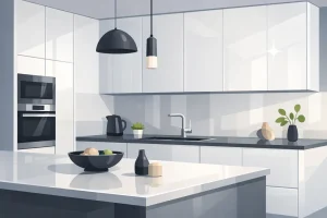

You're probably standing in a kitchen that still functions, but doesn't feel right anymore. The cabinets are tired, the room looks flatter than it should, and you want a change that won't feel dated in a few years. If that sounds familiar, navy is one of the smartest directions you can take.
I'll be blunt. Navy blue kitchen cabinets can look expensive, settled, and architectural. They can also look heavy, muddy, and depressing if you make lazy choices with finish, lighting, and surrounding materials. Most generic advice online skips the part that actually matters in real homes across Toronto and Markham, where grey winters, tree cover, narrow lots, and shaded rear kitchens change how dark cabinetry reads.
Done properly, navy doesn't feel trendy. It feels considered.
Navy works because it gives you the depth of a dark kitchen without the harshness of pure black. It has presence, but it still reads as colour. That matters in a family kitchen, especially if you want the room to feel grounded and elegant instead of cold or severe.
As of 2026, blue kitchen cabinets, including navy, are still in style, and navy is specifically favoured for its deep, timeless appeal that resists dating trends, making it a stable choice for homeowners according to this 2026 kitchen design overview. I agree with that. Navy has enough classic weight to last, but enough softness to live comfortably in both older Toronto houses and newer Markham builds.
Some cabinet colours depend on novelty. Navy doesn't. It already has design history behind it, which is why it moves easily between styles:
- In transitional kitchens, navy feels refined and balanced.
- In modern kitchens, it sharpens clean lines and gives slab doors more depth.
- In traditional spaces, it pairs naturally with millwork, stone, and warm metals.
That's the test of a lasting cabinet colour. It doesn't force one look.
Practical rule: If a colour only works in one design style, it's a risk. Navy works with modern, classic, and in-between kitchens, which is why it keeps holding up.
It adds contrast without making the room chaotic
Toronto homeowners often want a kitchen that feels upscale but not showy. Navy does that better than most colours because it anchors the room without demanding ten other dramatic choices. You can pair it with white counters, warm oak floors, brass pulls, stainless appliances, or cream uppers and still keep the kitchen coherent.
That flexibility is why dark cabinetry remains such a strong category. If you're comparing deeper cabinet options, this gallery of dark kitchen cabinet ideas is useful for seeing how different dark tones shift the mood.
It's a common mistake. They choose navy, then throw in busy veining, flashy pendants, a loud backsplash, and three metal finishes. Navy doesn't need help. It needs restraint.
Use it as the anchor. Let one or two supporting materials do the rest. That's how you get a kitchen that still looks good after the renovation excitement wears off.
Colour is only half the decision. The material and finish determine whether your navy cabinets look refined or cheap. If the surface quality is poor, navy exposes it fast. Brush marks, uneven sheen, and weak door construction are much easier to notice on dark cabinetry.
The good news is that navy works across several cabinet materials. The trick is matching the product to the way you live.

The finish matters more than most homeowners think
For navy blue kitchen cabinets, the most commonly recommended and widely used finishes are matte and satin, with matte preferred for its contemporary look and fingerprint resistance, while satin adds a subtle sheen that makes navy appear richer under lighting. Shaker-style navy cabinets are also identified as a classic, current choice in this cabinet finish and style guide.
That lines up with what I recommend in practice:
- Choose matte if you want a softer, modern look and you hate seeing fingerprints.
- Choose satin if you want the navy to feel a bit more polished and lively under light.
- Skip high gloss unless the whole kitchen is intentionally modern. It can look striking, but it's unforgiving.
Material choices that actually make sense
You don't need every option on the market. You need the one that fits your budget, layout, and tolerance for wear.
| MapleKing Navy Cabinet Material Comparison | Best For | Finish Options | Durability |
|---|---|---|---|
| Real wood painted doors | Homeowners who want visible character and a more natural feel | Matte, satin | Strong and long-lasting with proper finish care |
| HDF painted cabinets | Clean, consistent colour and a smoother factory look | Matte, satin, high gloss | Very durable for everyday kitchen use |
| Matte HDF | Busy family kitchens where fingerprints are a daily issue | Matte | Practical and resilient |
| High-gloss HDF | Contemporary kitchens with simple lines and controlled lighting | High gloss | Durable surface, but visually unforgiving |
| Laminate cabinets | Rental units, investment properties, and hard-wearing households | Matte or low-sheen depending on line | Tough against moisture, scratches, and stains |
| HDF thermofoil | Homeowners who want an easy-clean, seamless finish | Typically smooth low-sheen finishes | Good durability when quality manufacturing is strong |
If you're weighing substrate quality and long-term value, this guide to the best material for kitchen cabinets is worth a read.
My direct recommendations
For most Toronto and Markham homes, I'd narrow it down fast.
Best choice for a high-end painted look
HDF with a factory-applied satin or matte finish is the safest recommendation. It gives you a smoother, more even result than many lower-grade painted products, and navy benefits from that consistency.
Best choice for warmth and character
Real wood painted doors work well if you want a kitchen that feels less slick and more custom. A bit of natural grain can soften navy beautifully, especially in older houses with wood flooring and traditional trim.
Don't pick a cabinet finish in isolation. Navy reads differently on a dead-flat surface than it does on a soft satin. The same colour chip can feel heavier or lighter depending on sheen.
Best style pairing
If you want the easiest path to a timeless result, choose Shaker doors. They give navy structure. The colour feels framed and intentional rather than like a giant flat block. If your home is more contemporary, slab doors can work well, but only if the rest of the kitchen is disciplined and minimal.
The wrong move is trying to make one cabinet choice solve every design problem. Pick the material for durability. Pick the finish for how you want light to hit the surface. Pick the door style for the character of the room.
Navy cabinets don't finish the kitchen. They set the tone. The room still needs contrast, temperature, and texture. Without that, the whole design feels flat.
A strong navy kitchen usually comes down to one thing. Balance dark cabinetry with lighter, warmer, or more tactile materials.

Three pairings that consistently work
Warm and classic
Use navy lower cabinets with creamy uppers, white or softly veined quartz, and light oak flooring. Add aged brass or warm-toned hardware. This is one of the easiest ways to make navy feel welcoming instead of formal.
Backsplash choices matter here. Keep them simple. Handmade-look white tile, soft ivory tile, or a full-height stone splash all work.
Cool and modern
Pair navy with crisp white counters, pale grey porcelain flooring, and restrained hardware in brushed nickel or stainless. Slab doors make sense here. So does a cleaner backsplash with less texture.
This look works best in condos and newer suburban homes where you want the kitchen to feel refined, not rustic.
Bold but controlled
If you want a bit more personality, use navy on all lowers and the island, then introduce a backsplash with shape or pattern. Herringbone, elongated subway, or subtle geometric tile can all work if the colours stay tight. This collection of kitchen backsplash ideas is useful if you're trying to sort through options without ending up with something busy.
Here's the shortlist I give clients most often:
- Countertops: White quartz, off-white stone, or softer marble-look surfaces give navy needed contrast.
- Flooring: Light oak, natural oak, or calm mid-tone floors stop the room from feeling bottom-heavy.
- Wall colour: Cream, warm white, light greige, or a soft neutral keeps the room open.
- Accent texture: Wood stools, woven shades, linen drapery, and natural stone stop the kitchen from feeling over-finished.
The common mistake is trying to “match” navy with more blue. Don't. Navy is the strong note already. Supporting materials should calm the composition.
A useful visual on this problem comes from the discussion below on dark cabinetry and room feel.
A good navy kitchen has contrast in value, contrast in texture, and restraint in colour. Miss any one of those, and the design starts to drag.
The Finishing Touches Hardware and Lighting Design
Most navy kitchen failures aren't colour failures. They're lighting failures.
People choose a nice navy sample in a bright showroom or under ideal photography, then install it in a kitchen with weak ceiling fixtures, no under-cabinet lighting, and a finish that absorbs more light than they realised. Then the cabinets look flat, nearly black, and heavier than expected. That's where regret starts.
Hardware sets the temperature of the room
Before lighting, pick the mood you want from your metal finishes.

Brass and gold
These warm up navy immediately. They suit transitional and classic kitchens, and they help dark cabinetry feel richer and more welcoming.
Chrome and brushed nickel
These keep the palette cooler and cleaner. If your kitchen has stainless appliances and a more contemporary profile, this route usually makes more sense.
If you're still comparing pull styles, finishes, and long-term practicality, this guide to durable kitchen hardware choices is a helpful outside reference.
The real issue is light volume compensation
Dark cabinetry lowers the perceived brightness of a room. In the navy category, this problem gets worse when people rely on decorative advice instead of actual lighting strategy.
A critical overlooked issue with navy kitchens is light volume compensation. Dark cabinetry is linked to a 25% reduction in perceived ambient light without supplementary strategy, and matte finishes absorb 15% to 20% more light than satin, which makes the colour appear deeper and less airy in dim spaces according to this discussion of lighting problems in navy kitchens.
That matters in Toronto and Markham more than many people admit. Lots of kitchens here deal with shaded backyards, semi-detached side walls, overcast winter light, and north-facing exposures. A matte navy that looks elegant at noon in July can feel oppressive on a dark January afternoon.
Design warning: Don't choose matte navy just because it's fashionable. In a low-light kitchen, it can pull the whole room downward.
My no-nonsense lighting recommendations
If you're installing navy blue kitchen cabinets, treat lighting as part of the cabinetry decision, not a separate decorating layer.
Use under-cabinet lighting
This is not optional. It lights the work surface and helps the lower edge of the upper cabinets read clearly. Without it, navy often loses definition.
Layer your lighting
A good navy kitchen needs more than one source. Use ceiling lighting for general illumination, pendants where appropriate, and under-cabinet lighting for task work. One centre fixture won't carry the room.
Match your hardware to your lighting mood
Warm brass works best under warm, flattering light. Cooler metals tolerate a crisper visual environment. If those elements fight each other, the kitchen feels disjointed.
A successful navy kitchen isn't just about the cabinet colour. It's about making sure the room lets that colour show up properly.
New Cabinets vs Repainting Your Existing Ones
Repainting sounds cheaper. Sometimes it is. But cheaper and smarter are not the same thing.
If your existing cabinet boxes are solid, the layout works, and the doors are worth saving, repainting can be reasonable. If the kitchen has awkward storage, worn doors, poor proportions, or dated profiles, repainting is lipstick on a problem.
When repainting makes sense
Repainting is the better option when the cabinet structure is still good and you like the kitchen layout. In that case, a skilled spray finish can refresh the room without the disruption of a full cabinet replacement.
If you're considering that path, review what a specialist process looks like through this example of professional kitchen cabinet repainting. The useful takeaway isn't geography. It's the standard of prep and finish required if you want a painted result to look intentional.
Where repainting falls short
Dark colours are unforgiving. Navy especially exposes poor prep, filler lines, old damage, uneven surfaces, and weak brushwork. If the existing doors have expanded joints, chips, tired profiles, or low-grade materials under the paint, the new colour won't hide it. It often highlights it.
Repainting also doesn't solve the bigger design issues:
- Bad layout stays bad
- Weak drawer storage stays weak
- Old hinges and worn hardware locations remain
- Door style limitations remain visible
If your kitchen needs a different footprint, better function, or a cleaner door style, repainting won't get you there. It only changes the surface.
Why new cabinets usually win for dark finishes
Factory-finished cabinetry generally gives you a more controlled result for navy. The finish is more consistent, edges are cleaner, and you can choose the exact door style and material that fits the home. That matters because dark cabinets need precision to look expensive.
New cabinetry also gives you the chance to fix what homeowners complain about most after the novelty wears off. Awkward corners. Wasted upper space. Shallow drawers. Too little pantry storage. An island that's the wrong size. These aren't paint problems.
If your current kitchen already frustrates you, don't sink effort into preserving the frustration in a different colour. Replace the cabinetry and solve the actual problem.
Budgeting Your Project in Toronto and Markham
Budget planning gets messy when homeowners focus only on cabinet price and ignore the factors that shape the outcome. Navy kitchens magnify that mistake because finish quality, lighting, and surrounding materials all matter more with a dark cabinet colour.
The smarter way to budget is to separate the project into decisions that affect appearance and decisions that affect function. Then you can spend where it shows and trim where it doesn't.
Where to spend and where to be disciplined
Spend money on the parts that are hard to fake:
- Cabinet construction and finish quality
- Functional storage
- Lighting integration
- Countertop material that gives navy proper contrast
Be more restrained with things that can get too decorative too quickly:
- Statement pendants
- Trendy tile shapes
- Overly elaborate hardware
- Too many accent finishes
A navy kitchen looks high-end when the fundamentals are right. It does not need layers of expensive visual noise.

A practical GTA mindset
Toronto and Markham homeowners often juggle one of two scenarios. Either they want a polished custom look without wasting budget, or they're trying to maximise value in a family home, rental, or resale property. In both cases, chasing the cheapest cabinet quote usually backfires.
Look at the whole package instead:
| Priority | Why it matters in a navy kitchen |
|---|---|
| Finish quality | Dark paint shows defects quickly |
| Material choice | Surface consistency affects how navy reads |
| Lighting allowance | Poor lighting causes most navy disappointment |
| Layout planning | New cabinetry should improve function, not just appearance |
| Installation quality | Tight reveals and clean alignment matter more with dark doors |
If you're planning locally, it helps to work with a cabinet supplier you can visit in person, review finishes with, and compare options side by side. That's especially useful when choosing navy, because tone and sheen are much easier to judge on actual samples than on a screen.
Don't budget for cabinets in isolation
Cabinets, counters, backsplash, flooring, and lighting all affect how navy performs. Treat them as one design decision. If you underfund the lighting or choose the wrong countertop tone, even good navy cabinetry can look off.
That's why a disciplined plan beats impulse upgrades every time.
They can, if the room is already dim and you pair them with dark counters, dark floors, and weak lighting. They won't if you balance them properly with lighter surfaces, reflective contrast, and an edited palette. The issue isn't navy alone. It's what surrounds it.
What finish is easiest to live with?
For most households, matte and satin are the practical choices. Matte is good at hiding fingerprints. Satin gives the colour a bit more life. Choose based on your lighting and how much surface marking annoys you.
Not always. In many Toronto kitchens, navy lowers or a navy island with lighter uppers is the better move. It keeps the room brighter and gives you contrast without making the entire kitchen feel dense.
Brass if you want warmth. Brushed nickel or stainless if you want a cleaner, cooler look. Pick one direction and stay consistent.
Lighting is the answer. For navy blue kitchen cabinets to render as a deep, true blue rather than muddy black, a lighting strategy targeting 3000K to 3500K with under-cabinet task illumination is critical according to this guide on incorporating navy cabinets into a modern kitchen. If you skip that, you're guessing.
Navy isn't difficult. It just punishes sloppy planning faster than lighter cabinet colours do.
No. Not when the kitchen is well designed. Navy has enough classic character to appeal broadly, especially when paired with neutral counters and timeless hardware. A bad navy kitchen hurts resale. A good one enhances the room.
If you're ready to renovate and want a navy kitchen that looks refined instead of risky, MapleKing Kitchen Cabinets is a smart local place to start. Their factory-direct approach, custom options, and Markham showroom at 270 Esna Park Dr. make it easier to compare finishes, materials, and layouts in person, then build a kitchen that suits your space, your budget, and the way your home gets light.