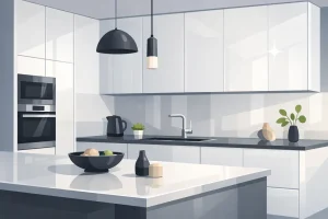

You're probably staring at cabinet samples that all looked sensible at first. Warm white felt safe. Grey felt current. Sage felt softer. Then duck egg blue showed up and suddenly the whole kitchen felt lighter, calmer, and a lot more personal.
That reaction makes sense. In Toronto and Markham homes, especially where kitchens need to work hard through dark winters, bright summer mornings, and everyday family use, colour isn't just decoration. It affects how spacious the room feels, how clean the cabinetry looks, and whether the kitchen still feels right a few years from now. Homeowners who are also planning a hygienic modern kitchen often end up gravitating toward colours that feel fresh without looking clinical. Duck egg blue sits in that sweet spot.
A Timeless Colour for Your Modern Kitchen
Duck egg blue has a rare advantage in kitchen design. It brings colour into the room without making the room feel busy. That matters when you're choosing a finish for cabinet doors, panels, and tall pantry units that cover a large visual area.
In practice, this shade works well for homeowners who've grown tired of flat greys and sharp all-white kitchens but still want something restrained. It has enough softness for a heritage home in Markham, enough clarity for a downtown condo, and enough character to stop a kitchen from feeling like a showroom display.
Why homeowners keep coming back to it
Some colours ask the whole room to revolve around them. Duck egg blue doesn't. It supports other elements well.
- With wood, it feels natural and relaxed.
- With white counters, it looks crisp instead of sugary.
- With brass or aged metal, it picks up a more refined, classic mood.
- With black accents, it reads cleaner and more architectural.
Duck egg blue works best when the homeowner wants the kitchen to feel lighter, not louder.
Another reason it lasts is that it doesn't depend on one trend cycle. The shade has enough history behind it to feel familiar, but it still suits slab doors, Shaker fronts, and more contemporary flat-panel layouts. That range is useful in the GTA, where one street may mix older detached homes, renovated semis, and newer townhouses.
Where it succeeds and where it struggles
It succeeds in kitchens that need softness, reflected light, and a calm backdrop for daily life. It struggles when homeowners expect it to behave like a strong navy or a clean mint. It isn't either. The appeal is in the middle ground.
That's also why a duck egg blue kitchen needs a bit more thought than a basic white one. The material under the finish matters. The lighting matters. The season matters. In Toronto and Markham homes, those details change the result more than is often realized.
What Exactly Is Duck Egg Blue
A Toronto homeowner often sees duck egg blue in one showroom, then brings the sample home and wonders why it suddenly looks greener, flatter, or colder. That confusion usually starts with the name. Duck egg blue is a real colour family, but in kitchens it sits in a narrow range between pale blue, soft green, and a muted aqua. If the balance shifts too far in any direction, it stops reading as duck egg blue and starts reading as mint or baby blue.
The name comes from the shell colour laid by certain ducks. That shell tone is linked to biliverdin during shell formation, as noted in this explanation of duck egg colour genetics, which found that blue-shelled ducks have statistically higher biliverdin levels (P < 0.01). In design terms, that natural reference matters because the colour tends to feel settled and familiar rather than synthetic.

The technical side that affects how it looks in a kitchen
Digitally, Duck Egg Blue is identified as #C3FBF4. It contains 76.47% red, 98.43% green, and 95.69% blue, with a natural luminance of 87%, according to the ArtyClick colour specification for Duck Egg Blue. In HSL, it sits at 172° hue, 84% saturation, and 87% lightness.
For a kitchen, the practical point is simpler than the colour math. This is a light, reflective shade with enough green in it to soften the blue. In many Toronto and Markham homes, especially ones with north-facing windows or long winter shadows, that softness can help a kitchen feel calmer without going grey. In strong south or west light, the same colour can look cleaner and slightly brighter, which is why I always tell homeowners to view samples morning, afternoon, and at night under their actual fixtures.
Material changes the result too.
On painted wood, duck egg blue often shows more depth because the surface has slight grain movement and a different paint absorption pattern. On smooth HDF doors, the colour usually reads more even and a touch more modern. On thermofoil, it can look crisp and durable, but the exact undertone matters more because the finish reflects light differently than brushed paint. Homeowners choosing between finishes should compare actual door samples, not only paint chips, and review proven paints for kitchen cabinets before locking in a final colour.
Why it doesn't feel muddy
Good duck egg blue stays clear under changing light. Poor versions go dull fast.
That is the difference most homeowners notice after installation. A well-balanced duck egg blue keeps a soft blue-green identity under daylight, LED lighting, and the lower natural light we get through much of the year in the GTA. A weak version picks up too much yellow from warm bulbs, too much green from reflected trees, or too much grey from an overcast day.
The safest sample is usually the one that still looks composed on a full door front, beside your counter, backsplash, and flooring. If it only looks good on a tiny swatch, it is not the right duck egg blue for a kitchen.
Creating a Harmonious Kitchen Colour Palette
Most homeowners don't struggle with whether duck egg blue is pretty. They struggle with what to put around it. The right supporting palette determines whether the kitchen feels crisp, moody, gentle, or slightly off.

Classic and crisp
This is the easiest palette to live with. Pair duck egg blue lower cabinets or a full run of Shaker doors with white counters, soft white walls, and light oak or walnut accents.
It works because the white sharpens the pastel note, while wood stops the kitchen from feeling cold. If a homeowner wants a look that feels current but not severe, this is usually the safest route.
Good additions in this palette include:
- Natural timber shelving for warmth
- White quartz or marble-look counters for clarity
- Simple black pulls for definition
- Creamy wall paint instead of stark brilliant white
Modern and bold
If you want duck egg blue to feel more tailored, bring in contrast. Charcoal stools, black-framed lighting, and brass hardware push the colour into a more designed, urban direction.
This version suits condos and newer homes especially well because the contrast gives the kitchen structure. The blue reads less cottage, more composed.
For more visual direction, it helps to browse examples of painted kitchen cabinet ideas and compare how the same cabinet colour changes when the hardware and surrounding finishes change.
Soft and serene
This approach employs the shade subtly. Pair it with muted stone, soft greige, pale wood, and subtle brushed metals. It's a good fit for family kitchens where the goal is calm rather than statement-making.
The risk here is letting everything become too pale. You still need some anchor points. That could be a darker floor, a stronger countertop edge, or slightly deeper wall colour.
Practical rule: If everything around duck egg blue is soft, add at least one element with visual weight so the room doesn't drift.
Lighting decides whether it reads blue or green
Many kitchens err in this regard. The colour's perceptual ambiguity comes from its low saturation and moderate lightness, placing it near a blue-green boundary where human vision is highly sensitive to shift. In Greater Toronto homes, 4000K to 5000K LEDs can exaggerate green undertones, as explained in this discussion of duck egg blue colour shift.
That means the same cabinet door can look calmer and bluer in one kitchen, then noticeably greener in another.
A simple way to test it is to view the sample in three conditions:
- Morning daylight near the window
- Evening light with your chosen under-cabinet and ceiling fixtures on
- Shadow areas beside tall units or pantry runs
This short visual walk-through helps show how a blue kitchen can be styled in a modern way.
If you want it to stay more blue, avoid very cool lighting and be careful with overly green countertops or backsplashes. If you like a slightly greener, softer reading, warmer natural textures will support that shift.
The Best Cabinet Materials for Duck Egg Blue
A duck egg blue sample can look soft and balanced on a small card, then turn flat, cold, or too sweet once it covers twenty cabinet doors. In Toronto and Markham kitchens, the material under that colour matters almost as much as the colour itself. Winter light is weaker, many homes mix natural and LED light, and finish texture changes how this shade reads from one wall to the next.
I usually narrow the decision this way. Choose the look first, then check whether the material can hold that look under daily use.
Real wood painted doors
Painted wood gives duck egg blue the most depth. You see a little grain, a little movement, and a finish that feels established rather than overly perfect.
That works well in older Markham homes, transitional kitchens, and spaces with crown moulding, panelled details, or warmer floors. The trade-off is maintenance and consistency. Wood expands and contracts with seasonal humidity, and in Southern Ontario that movement can show at joints or through the grain over time. If a client wants a very even pastel, wood is not always the cleanest route.
Best use: Shaker doors, feature islands, and kitchens with a classic or heritage character.
Painted HDF
For many MapleKing projects, painted HDF is the safest choice for duck egg blue. The face is smoother than wood, the colour stays more consistent across a full run, and the final kitchen usually looks closer to the approved sample.
That matters with a soft colour like this. HDF does not have the same natural variation as wood, so the blue feels calmer and more controlled. It suits both slim Shaker and flat-panel doors, which makes it useful in Toronto semis, newer Markham builds, and condo renovations where homeowners want a painted look without the unpredictability of timber.
Best use: full kitchen runs, balanced modern-traditional designs, and homeowners who want colour consistency.
High-gloss HDF
High-gloss HDF gives duck egg blue a sharper, more contemporary feel. It reflects light back into the room, which can help in smaller kitchens or condo layouts with limited window exposure.
There is a trade-off. Gloss makes every shift in light more obvious. In a south-facing kitchen the colour may read brighter and cleaner. In a shaded corner or under cooler LEDs, it can tip greener faster than homeowners expect. It also shows smudges, so it suits lower-traffic kitchens better than busy family spaces.
Matte HDF
Matte HDF pulls the colour in the opposite direction. It cuts glare, softens the cabinet face, and lets duck egg blue be a quiet presence in the room.
This is often the better fit for open-concept homes in the GTA where the kitchen has to work with the living and dining area, not compete with them. Matte finishes also hide fingerprints better than gloss, which is useful for families with young kids. If the goal is a modern kitchen that still feels relaxed through winter, matte HDF is often the better call.
If you want duck egg blue to read steady and understated, matte usually does the job better than gloss.
Laminate and thermofoil
Laminate and thermofoil make sense when durability and cleaning sit high on the list. They handle everyday splashes well, wipe down easily, and work for rental properties, family kitchens, and budget-conscious renovations.
Thermofoil over HDF gives a smooth, uniform surface that suits modern door styles. Laminate is similarly practical, though it can look more manufactured up close than a painted finish. Some homeowners are happy with that trade-off because performance comes first. Others prefer painted HDF because duck egg blue tends to look richer on it.
If you're comparing practical options in more detail, this guide to the best materials for kitchen cabinets lays out how each one handles wear, moisture, and long-term use. If you're repainting existing laminate fronts instead of replacing them, Newline Painting's cabinet makeover guide is a useful reference on prep and adhesion.
MapleKing Cabinet Finishes for Duck Egg Blue
| Material/Finish | Appearance | Durability | Best For |
|---|---|---|---|
| Real wood painted | Visible character, subtle grain influence, classic depth | Good, with natural variation | Traditional and transitional kitchens |
| Painted HDF | Smooth, uniform, colour-consistent | Strong everyday performance | Most full kitchen renovations |
| High-gloss HDF | Reflective, modern, light-enhancing | Durable, but shows reflections clearly | Condos and contemporary spaces |
| Matte HDF | Soft, understated, low-glare | Practical for daily use | Calm, refined family kitchens |
| Laminate | Clean, straightforward, practical | Moisture and stain resistant | Budget-conscious and high-traffic spaces |
| Thermofoil HDF | Uniform, easy-clean, neat profile | Good for busy kitchens | Modern family kitchens and easy maintenance |
Local Inspiration for Toronto and Markham Homes
You see this all the time in the showroom. A Toronto homeowner falls for duck egg blue on a bright spring afternoon, then worries in January that the same colour will look flat at home. That concern is valid. In the GTA, seasonal light changes the read of soft cabinet colours more than online inspiration photos suggest.
A south-facing kitchen in a newer Toronto build can make duck egg blue look fresh and airy. A north-facing Markham kitchen, especially one with deeper eaves or mature trees outside, can pull the same colour quieter and slightly greyer. Neither result is wrong, but the cabinet finish, lighting plan, and surrounding materials need to be chosen for the house you live in.

A heritage home in Markham
Older Markham homes often bring warm-toned flooring, more millwork, and smaller window openings. Duck egg blue usually sits best here when it has some warmth around it. Creamy whites, aged brass, white oak, and quieter stone patterns keep the colour soft rather than chilly.
I usually caution clients against stacking too many cool finishes in these homes. Cool white LEDs, blue-grey counters, and icy backsplash tile can strip the character out of the room. If the goal is calm and classic, a slightly warmer supporting palette does the heavy lifting.
A downtown Toronto condo
In a condo, duck egg blue tends to read cleaner and more contemporary. Flat-panel doors, slim hardware, and simpler lines suit it well, especially if you want colour without making the kitchen feel busy.
A key consideration is lighting consistency. Many Toronto condos rely on ceiling pots, pendants, and under-cabinet strips for most of the day, even in summer. That is why I prefer testing a full-size door sample in the actual unit, under the exact bulbs and at different times of day. A small chip rarely tells the truth.
What usually helps in winter
Toronto winters are hard on pale colours. The kitchens that still feel good in February are usually the ones where colour and lighting were planned together.
- Even ambient lighting prevents dark corners that make duck egg blue look dull
- Good task lighting keeps counters bright and helps the colour read cleaner
- Warm companion materials such as oak, walnut, brass, or softer white countertops keep the room balanced
- Full-height samples show far more than a tiny swatch, especially in long kitchens or north-facing rooms
This applies whether the cabinets are painted HDF, thermofoil, or painted wood. In many Toronto and Markham projects, HDF gives the most reliable colour consistency, while thermofoil suits homeowners who want easier wipe-down maintenance and a more controlled finish. The trade-off is visual depth. Painted surfaces usually have more richness, while thermofoil often reads flatter but more uniform.
If you want the room to feel finished, treat the cabinets as part of the whole envelope. Wall colour, flooring, backsplash sheen, and even fabric choices nearby affect how duck egg blue lands. The same care principles described in this luxury upholstery cleaning guide apply to kitchen planning too. Materials perform best when the full setting is considered, not chosen in isolation.
Maintaining Your Duck Egg Blue Kitchen
A duck egg blue kitchen is easy to live with if the finish suits the household. Maintenance should feel routine, not precious.
For painted wood and painted HDF, use a soft cloth and a gentle cleaner. Avoid abrasive pads, especially around handles and drawer pulls where repeated rubbing can dull the finish over time. High-gloss surfaces need the most care with wiping technique because they show streaks and fine marks more readily. Matte finishes are more forgiving visually, but they still benefit from non-abrasive cleaning.
Finish-specific habits that help
- High-gloss HDF responds best to soft microfibre cloths and light pressure.
- Matte HDF hides daily wear well, but grease should still be cleaned before it builds.
- Thermofoil and laminate are usually the simplest for busy family kitchens because the surfaces wipe clean easily.
- Painted wood rewards a gentler hand and more consistent maintenance.
A useful rule is to treat cabinetry the way you'd treat other refined interior finishes. The care mindset in a luxury upholstery cleaning guide applies here too. Gentle products, regular upkeep, and avoiding harsh scrubbing preserve the look far better than occasional aggressive cleaning.
Will it date quickly
Usually, no. Duck egg blue lasts when the surrounding design is disciplined. If the counters, flooring, hardware, and lighting are balanced, the colour reads classic rather than novelty.
The kitchens that age badly are usually the ones that chase effect over proportion. Duck egg blue doesn't need theatrical tile, busy veining, and five competing metal finishes. It does better with restraint. That's why it keeps showing up in kitchens that still feel composed after the initial renovation excitement wears off.
If you're ready to see how Duck Egg Blue looks on real cabinet materials, MapleKing Kitchen Cabinets can help you compare finishes, door styles, and practical options for Toronto and Markham homes. It's a good next step if you want a kitchen that looks calm in a sample and still feels right once it's installed.