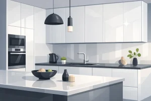

You’re probably doing what most first-time kitchen renovators in Markham and Toronto do. You’re standing in front of a wall of cabinet samples, you’ve found a brown finish you love, and then the panic starts. Which wall colour works with it? Will the countertop make it look muddy? Does brown feel timeless or too dark?
That confusion is normal. Brown is one of the easiest cabinet colours to like in a showroom and one of the hardest to finish well at home. Not because brown is limiting, but because brown changes character depending on its undertone, sheen, lighting, and neighbouring colours.
A good brown kitchen can feel warm, refined, calm, contemporary, rustic, or luxe. A mismatched one can feel heavy in a hurry. The difference usually comes down to a few decisions that seem small when you’re choosing samples.
Your Guide to Perfect Brown Colour Pairings
Brown gets treated like a fallback neutral, but that’s not how designers use it. In a kitchen, brown is often the grounding element that gives everything else direction. It can soften bright surfaces, make compact condo kitchens feel more established, and bring a sense of permanence that plain white kitchens sometimes miss.
That matters in the GTA, where light conditions vary a lot. A north-facing Toronto condo kitchen doesn’t read colour the same way as a sun-filled detached home in Markham. Brown helps anchor a space in both settings, but only if the supporting colours are chosen with intention.
Here’s the practical way to think about colours that go with brown:
- Read the undertone first. Not all browns are the same.
- Match the temperature. Warm browns usually want warm partners. Cooler browns usually want cooler ones.
- Control contrast. You need enough lightness difference so the kitchen feels clear, not flat.
- Let materials guide colour. Wood grain, high-gloss panels, matte finishes, and laminates all react differently to nearby colours.
If you like warmer accent ideas beyond kitchens, Lewis and Sheron Textiles' guide is a useful reference for understanding how earthy shades like burnt orange can sit beside brown without feeling chaotic.
Practical rule: Don’t choose the wall colour first. Choose the brown, identify its undertone, then build outward.
Once you understand that one idea, brown stops feeling tricky and starts feeling flexible.
Decoding the Undertones of Your Brown Cabinets

Most homeowners say “brown” as if it’s one colour family. It isn’t. Brown is more like coffee. Two cups can both be called coffee, but one has cherry notes, one feels nutty, and one tastes smoky. Cabinet browns work the same way. What you’re really seeing underneath is usually red, yellow, or grey.
That hidden undertone decides which colours will feel easy and which ones will fight back.
How to spot the undertone
Take a plain white sheet of paper or a clean white sample board and hold it beside your cabinet sample in daylight. Not under only showroom spotlights. Not under your phone flashlight. Daylight shows the truth faster.
Then ask these questions:
- Does the brown look a little rosy or chestnut? That’s a red-based brown.
- Does it lean honey, caramel, or oak-like? That’s a yellow-based brown.
- Does it feel smoky, mushroom, espresso-grey, or taupe? That’s a cooler grey-brown.
If you skip this step, you can end up pairing a warm maple stain with a cold blue-grey wall and wondering why the kitchen suddenly feels off.
Why cream and ivory work so often
One of the safest and strongest pairings for many brown cabinets is cream or ivory. In Toronto kitchen design, brown-stained maple cabinets paired with cream or ivory countertops were rated highest for perceived luxury and spaciousness by 68% of 1,200 surveyed Markham and Toronto homeowners in the Toronto Region Board of Trade’s 2024 Interior Design Report, as cited by Palette Hunt’s write-up on colours that go with brown. The same verified data notes that cream’s higher lightness creates stronger contrast with brown, and that low-contrast brown-grey combinations reduced perceived room brightness by 22% in simulated lighting. It also notes cream quartz resisted stains 40% better than darker tones in Ontario durability testing, and Sherwin-Williams Alabaster (SW 7008) was cited for 15+ year fade resistance, with renovated properties seeing a 12% resale value boost in Toronto Real Estate Board 2025 data.
That sounds technical, but the visual lesson is simple. Cream gives brown room to breathe.
Hold a brown sample against bright white, soft cream, and cool grey. Most people instantly see that one feels welcoming, one feels stark, and one feels dull.
A quick guide by undertone
| Brown undertone | Usually looks best with | Use caution with |
|---|---|---|
| Red-brown | cream, ivory, muted green, soft clay | icy grey, blue-white |
| Yellow-brown | warm white, sage, olive, muted mustard | pinkish grey, harsh cool white |
| Grey-brown | dusty blue, navy, soft greige, nickel tones | overly yellow cream |
The mistake people make in showrooms
They choose by the sample name. Espresso. Walnut. Oak. Mocha. Those names don’t help enough. Two “walnut” finishes can have totally different undertones.
What matters is what the finish does in your actual light. Bring samples to the window. Turn them vertically. Place them beside your flooring and your countertop shortlist. Brown is forgiving, but it isn’t random.
Simple Rules for Building a Harmonious Colour Scheme
Good colour pairing doesn’t need a design degree. In kitchens, I rely on a few repeatable rules. They’re easy to remember, and they stop you from buying a dozen test pots you won’t use.
Start with temperature
The basic rule is warm-with-warm, cool-with-cool.
A yellow-brown cabinet usually feels settled beside creamy whites, olive, muted terracotta, or soft brass. A grey-brown cabinet feels cleaner beside dusty blue, cooler greige, matte black, or polished nickel. When the temperature matches, the room feels intentional even if the palette is simple.
You can break the rule, but if you do, make it look deliberate. Pairing a warm brown with a cooler accent often works best when one of them is softened. Think rich brown cabinetry with a muted navy island, not a bright blue wall.
Three ways designers build a palette
Monochromatic
This is the calmest option. You use several versions of brown and nearby neutrals.
For example, imagine medium brown cabinets, a lighter taupe wall, creamy counters, and darker walnut stools. Nothing shouts, but the room has depth because each surface is slightly different.
This works especially well if your kitchen already has a lot going on, such as open shelving, a patterned floor, or visible grain.
Analogous
This means choosing colours that sit close to brown’s natural family. Since many browns carry orange, red, or yellow undertones, they usually pair smoothly with colours like terracotta, rust, ochre, olive, or muted green.
The kitchen feels rich instead of contrasty. That’s useful if you want warmth without a lot of visual tension.
Complementary
A room gains energy from certain color pairings. Browns often come alive beside blues and blue-greens. That’s why navy, teal, and sage work so well when used carefully.
A complementary scheme doesn’t need equal balance. Brown can stay dominant, and blue can appear only on an island, backsplash detail, runner, or wall.
Designer shortcut: If you want a kitchen to feel larger, increase the lightness contrast between your brown cabinets and the surfaces around them.
A simple before-and-after test
Take the same brown cabinet and imagine it in two settings.
- Setting one: brown cabinet, cool medium grey wall, dark counter, weak under-cabinet lighting.
- Setting two: brown cabinet, soft ivory wall, lighter counter, warm layered lighting.
The first setting often compresses the room. The second one usually opens it up. The cabinet colour didn’t change. The support colours did.
When bold pairings work
Some homeowners worry that brown means “stay neutral.” It doesn’t. Brown can support mustard, olive, dusty pink, muted teal, and navy very well. The key is restraint.
Use one dominant colour, one support neutral, and one accent. If everything competes, brown can start to look muddy. If one colour leads, brown becomes the anchor that keeps the kitchen grounded.
Curated Palettes for Popular Kitchen Styles in 2026
Some people don’t want theory. They want a palette they can use. That’s fair. Below are three practical directions I’d feel comfortable recommending in Toronto and Markham homes, each with a different mood and a different kind of brown.

GTA organic modern
This is the palette I’d suggest to the homeowner who wants warmth without heaviness. It suits newer Markham family homes, renovated townhouses, and condos where you want the kitchen to feel calm all year.
- Cabinet brown: warm walnut, approx. #6E4B3A
- Main wall colour: soft sage, approx. #A8B5A2
- Countertop: creamy quartz, approx. #F2EBDD
- Accent metal: brushed brass
- Backsplash direction: warm off-white zellige-style or simple matte tile
This brown-and-green family has real local traction. In the GTA, kitchen renovations with brown cabinetry and green accents saw a 27% increase in perceived home value according to a 2024 Ontario-focused Royal LePage Home Trends Report cited by House Beautiful’s article on colours that go with brown. The same verified data states that 68% of surveyed York Region homeowners reported higher satisfaction with earthy schemes, and brown-green combinations led to 15 to 20% faster sale times and an average resale premium of $18,500 in Markham’s Esna Park vicinity. It also notes that 42% of luxury kitchen projects in a 2025 IDAO Toronto trend forecast used brown cabinets with green elements, while TREB 2023 data showed homes with brown-dominant kitchens accented by nature-inspired greens sold at 8.2% above asking price, compared with 4.1% for neutral-only designs.
That doesn’t mean every kitchen should be green. It means green is one of the strongest partners when you want brown to feel fresh rather than dated.
Markham contemporary
This one suits homeowners who like cleaner lines and stronger contrast. Think slab fronts, integrated pulls, and a kitchen that feels precisely designed rather than rustic.
- Cabinet brown: deep espresso, approx. #4A342C
- Wall colour: crisp off-white, approx. #F7F4EE
- Secondary accent: muted navy, approx. #324C63
- Countertop: pale stone with soft movement
- Hardware: matte black or dark bronze
The reason this palette works is balance. Espresso already carries a lot of visual weight. The off-white keeps it from dominating, and navy adds depth without making the whole room darker.
If you’re collecting examples for painted cabinetry direction, painted kitchen cabinet ideas can help you compare how darker browns behave in more modern layouts.
Brown and navy work best when the white in the room is softened a little. Stark, icy whites can make brown look redder than you intended.
Toronto transitional
This is for the homeowner who likes classic details but doesn’t want a traditional kitchen that feels formal. It works well in older Toronto homes where you want to respect the architecture without freezing the space in time.
- Cabinet brown: medium oak or chestnut, approx. #8A6247
- Wall colour: greige, approx. #D9D0C6
- Accent colour: muted putty-blue, approx. #7F919E
- Countertop: ivory or lightly veined warm white
- Hardware: aged brass or polished nickel, depending on undertone
This palette is quieter than the first two. It’s useful when your kitchen opens into a dining room or family room and you need the colour story to flow across spaces.
How to choose among them
If you’re stuck, don’t ask which palette is best. Ask which problem you’re solving.
- Need more warmth in a cool condo? Choose organic modern.
- Need contrast in a compact kitchen? Choose contemporary.
- Need flexibility with existing finishes? Choose transitional.
The palette should support the way the room feels at 8 a.m. in winter and 6 p.m. in summer. In the GTA, that matters more than a showroom snapshot.
Matching Colours to Your Cabinet Material and Finish
The same brown colour behaves differently depending on the cabinet surface. Consequently, many online colour guides fall short. They talk about “brown cabinets” as if stained wood, matte HDF, high-gloss HDF, laminate, and thermofoil all reflect light the same way. They don’t.

Real wood painted doors
When wood grain stays visible, the colour around it needs to respect that movement. Strong patterns on the wall or a busy backsplash can compete with the grain and make the kitchen feel restless.
Best partners for visible grain include:
- Soft creams and ivories when the wood has warmth
- Sage and olive when you want a natural, settled look
- Muted clay or putty if you want warmth without obvious colour
- Dusty blue-greys only when the brown itself leans cooler
The goal isn’t just colour harmony. It’s letting the eye read the wood as texture, not visual noise.
High-gloss HDF
High-gloss brown cabinets reflect a lot more than people expect. In daylight, they bounce nearby colours back into the room. Under evening lighting, they can intensify shadows and highlights.
That’s why I usually pair high-gloss brown with matt or eggshell wall colours, not another shiny surface everywhere. A low-sheen wall gives the room contrast in texture, which makes the cabinetry feel more elegant.
Verified trend data for 2025 to 2026 notes that brown HDF painted doors saw 42% adoption in Ontario under eco-material trends, and that sage green or teal were identified as strong pairings for sustainable, high-gloss GTA kitchens in a summary citing CMHC and related trend sources through Jaipur Rugs’ discussion of colours that complement brown. The same verified data also notes that brown with dusty pink or soft lavender improved scratch camouflage by 30% in durability testing, and that triadic schemes featuring olive and yellow-brown align with Toronto’s 65% condo market.
That gives homeowners permission to think beyond beige. In the right finish, brown can hold a more modern accent than people expect.
Matte HDF
Matte brown is easier to live with in busy family kitchens because it hides glare. It also tends to make colour look slightly softer.
If you choose matte brown cabinetry, you can afford a little more texture elsewhere:
- a handmade-look backsplash
- a honed counter
- fluted glass on an upper cabinet insert
- a lightly veined slab
The finish already absorbs light. Texture gives the room life without demanding brighter colour.
Here’s a short visual reference worth watching before you finalise painted finishes:
Laminates
Laminate is practical, especially in homes with kids, rental properties, and investor upgrades. But practicality doesn’t mean you have to stay safe.
One of the more useful verified notes for laminates is that dusty pink or soft lavender can help camouflage scratches on brown laminates by 30% in lab testing, according to the same verified dataset cited above. That sounds surprising until you see it in person. These softened colours reduce the visual harshness of small marks because they don’t create severe contrast against mid-tone browns.
That doesn’t mean your whole kitchen should be pink. It might mean a soft mauve-grey wall, a muted runner, or bar stools with a dusty upholstery tone.
If you’re comparing finish options for a repaint or cabinet colour refresh, paint choices for kitchen cabinets is a practical starting point for sorting out sheen and surface behaviour.
HDF thermofoil
Brown thermofoil usually reads cleaner and more uniform than natural wood. Because the surface is unbroken and easy to wipe down, it works well with family-friendly colour schemes that need to stay looking tidy.
I like pairing brown thermofoil with:
- warm ivory for brightness
- muted navy for structure
- olive for softness
- gentle stone tones for resale-friendly calm
Uniform cabinet surfaces can handle bolder wall colour than strong wood grain can. If the cabinet face is visually quiet, the room has more room for colour elsewhere.
Finishing Touches That Elevate Your Brown Kitchen
A brown kitchen doesn’t feel polished because of cabinet colour alone. It feels polished because the finishing details support the brown instead of cancelling it out. Lighting, hardware, trim, ceiling paint, and backsplash all influence whether the room reads warm and layered or flat and unfinished.

Lighting changes everything
Brown is especially sensitive to light temperature. A warm brown cabinet under very cool lighting can look drained. A cooler brown under very warm lighting can start to look muddy.
The practical answer is to test your cabinet sample in the light you’ll use. Morning natural light, under-cabinet lighting, and evening ceiling fixtures can all shift the same finish. In many GTA homes, this matters because winter light is dimmer and cooler, while summer light can be stronger and greener.
Hardware isn’t a minor detail
Hardware acts like jewellery, but it also changes how your brown reads.
| Brown type | Hardware that usually works | Effect |
|---|---|---|
| Red-brown | warm brass, antique brass | adds richness |
| Deep espresso | matte black, dark bronze | sharpens contrast |
| Grey-brown | polished nickel, brushed nickel | keeps it tailored |
| Golden oak | aged brass, soft black | balances warmth |
One reason this matters in the local market is that GTA homeowners are leaning into earthy palettes. Verified regional data notes a 28% year-over-year increase in kitchen renovations among Markham and Toronto homeowners, with 62% favouring warm earth tones for moisture-resistant laminates, according to a Toronto Real Estate Board 2025 report cited in Stella’s Wardrobe’s article touching on colours that work with brown. The same verified dataset adds that pairings like brown with matte navy or ivory fit condo flips well, and that brown with mustard yellow was identified as a 2025 trend with potential resale upside of 15% in GTA staging data.
The useful takeaway isn’t “buy mustard yellow.” It’s that details are moving beyond plain beige and chrome. Homeowners are getting more comfortable with warmer, more character-driven finishing choices.
Trim, ceiling, and backsplash
People often assume trim and ceiling should be bright white. With brown kitchens, that can be too harsh. A softer off-white or cream usually gives a better transition, especially when the cabinets already carry warmth.
Backsplashes deserve the same care. If your cabinets are richly brown, the backsplash shouldn’t always compete. Sometimes the best move is a tile that adds texture more than colour. If you want to go more decorative, expert advice for kitchen wall murals can be helpful for understanding how feature surfaces can add personality without overwhelming the room.
For backsplash planning in a more practical cabinet-and-tile context, kitchen backsplash tile ideas can help you compare when to stay quiet and when to introduce pattern.
Brown kitchens rarely fail because the brown was wrong. They fail because the supporting finishes were chosen too sharply, too cool, or all at once.
A strong final check
Before ordering anything, put your chosen brown beside these five things at the same time:
- Wall paint sample
- Countertop sample
- Backsplash tile
- Hardware finish
- Flooring sample
If one item suddenly makes the brown look redder, yellower, or duller, pay attention. That’s not overthinking. That’s what saves you from expensive regret.
Start Your Beautiful Kitchen Renovation Today
Brown gives you more range than most homeowners expect. It can support soft cream, earthy green, muted navy, dusty pink, olive, mustard, greige, and layered wood tones. But the success of those colours that go with brown depends on a few grounded decisions.
Start by identifying the undertone. That one step prevents most colour mistakes.
Then choose the kind of harmony you want. Tonal and quiet. Warm and natural. Or sharper contrast with blue-based accents. After that, look at the cabinet material itself. Brown on visible wood grain behaves differently from brown on matte HDF or high-gloss surfaces, so your wall colour, backsplash, and hardware need to match the finish, not just the shade.
That’s also why it helps to make decisions in person. A cabinet sample in your hand tells you more than a digital swatch ever will. You can see whether the cream feels soft enough, whether the green reads fresh or too grey, and whether the hardware warms the brown or fights it.
If you’re renovating your first kitchen in Markham or Toronto, keep the process simple. Choose one brown you love. Add one supportive light neutral. Add one accent colour that suits the mood of your home. Then use lighting, hardware, and backsplash to complete the picture.
A well-designed brown kitchen doesn’t need to chase trends. It just needs to feel balanced, lived-in, and right for your space.
If you’re ready to turn ideas into a real plan, MapleKing Kitchen Cabinets can help you compare finishes, colours, and layouts in person. Visit the showroom at 270 Esna Park Dr. in Markham, request a free quote, or speak with a cabinetry specialist about a kitchen that fits your home, your budget, and the way you live.